Bagel Town
Brand Identity & Packaging
The Challenge
Bagel Town is a bold new food concept aiming to bring energy, colour, and character to the world of bagels. They needed a fun and distinctive brand identity that would stand out in a crowded market—both visually and conceptually—particularly targeting younger, urban audiences who value quick, quality food with personality.
The Solution
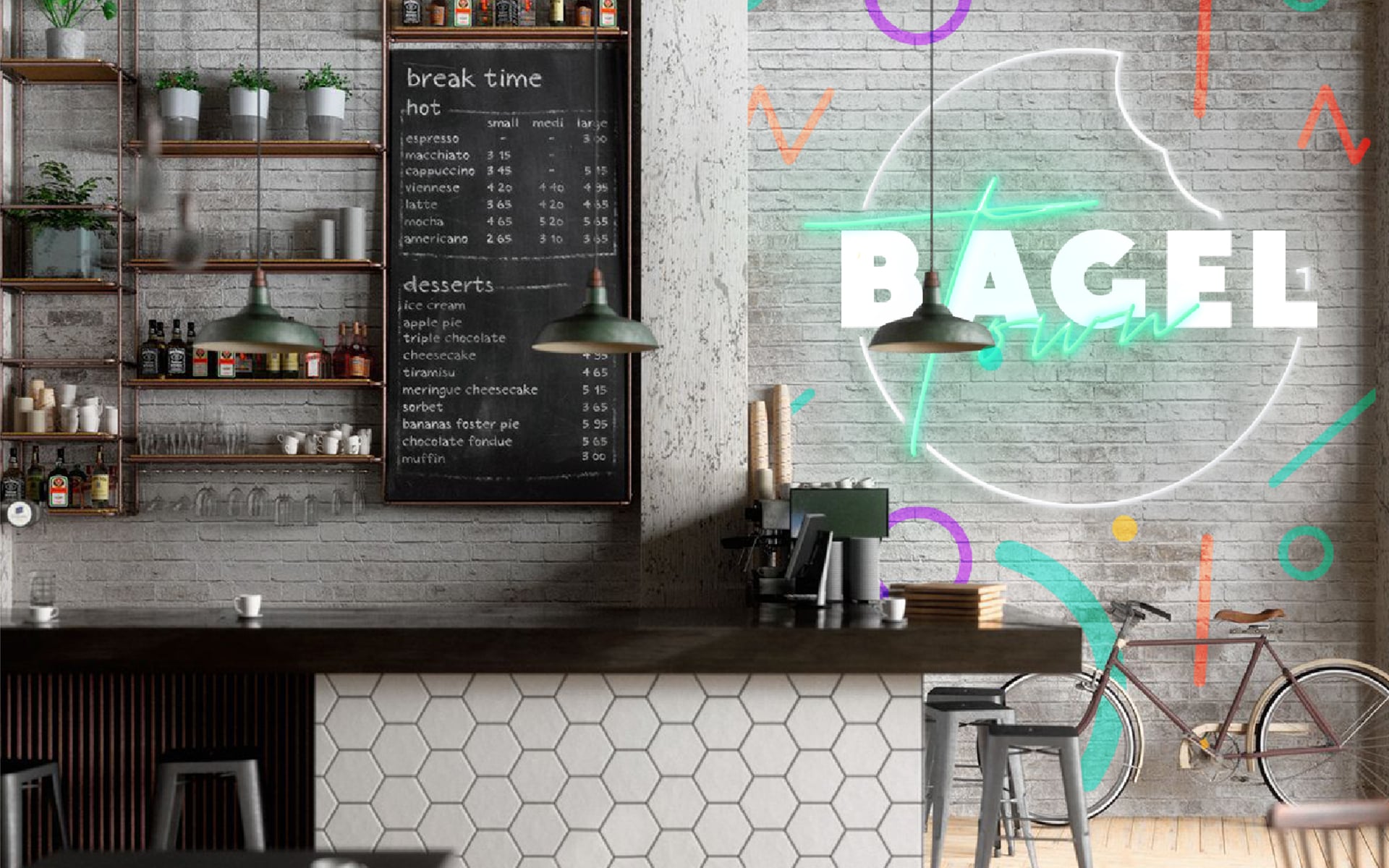
I created a playful and expressive identity built around a strong logomark featuring a bitten bagel silhouette. The wordmark combines bold geometric lettering with a hand-drawn "Town" script to give the brand a dynamic, layered voice. This contrast speaks to both quality and quirk.
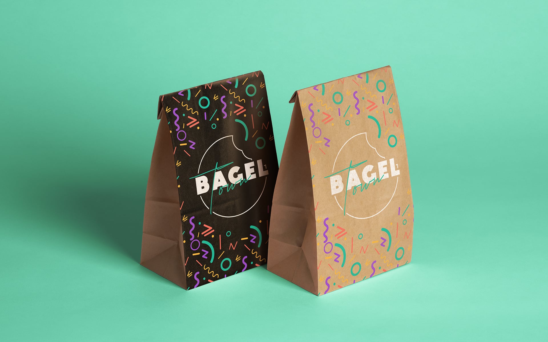
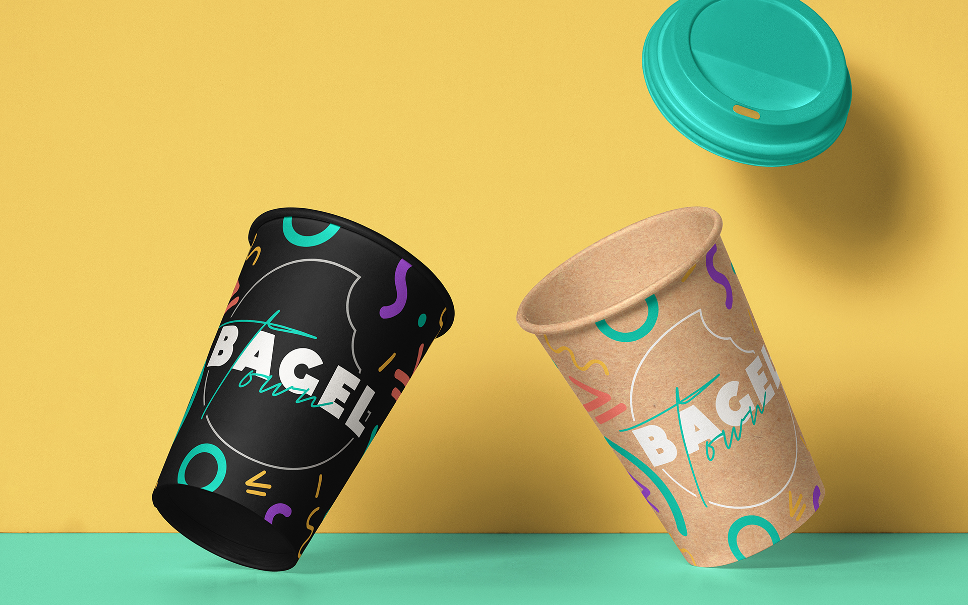
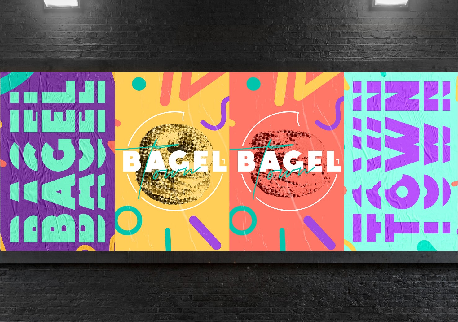
For the packaging, we developed two colorways: a vibrant dark version and a natural kraft option—both bursting with 90s-inspired shapes and patterns. These were designed to evoke a sense of fun and nostalgia, while remaining bold and modern. The pattern system adds visual energy and helps reinforce the brand across physical touchpoints.
The Results
The new identity and packaging system gave Bagel Town an unmistakable presence that customers could instantly recognize and share. The mix of retro-inspired visuals and confident branding set the tone for an upbeat, casual food experience. The brand now stands out on shelves, counters, and social feeds alike—inviting customers not just for a bite, but for a whole vibe.